yesterday i finally got to see the inside of the seaford surf life saving club. the [award-winning] building designed by robert simeoni is amazing and after seeing its exterior when first finished, i was hankering to check out the insides and have an awesome coffee right out on the beach, raising some cash for the club in the mean time.
i’m not sure how mr simeoni feels about it post-occupancy, but i’d have to say that i can definitely see the difference between the intentions of the person who designed it, the person who is running the space and the people who are using it. i can’t speak for the SLSC, but the cafe is such a disappointment – it oozes bottom line design.

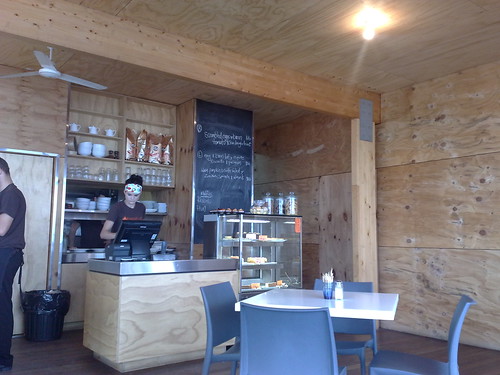
the space is all clean and raw materials – joined recycled pine beams, marine ply, stainless steel struts and wooden floors. the kitchen itself looks well-designed and it oozes potential. but, at 1:30 on a sunday afternoon, there were 5 tables, when it should have been rammed (even with the rain) and it was almost as cold and lifeless as the fake bodies being rescued by the crew next door.
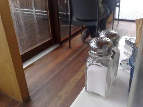
the tables were cheap plastic crap inside (and, ironically, beautifully recycled wooden ones saturated outside) and the chairs were even worse. there was off-the-shelf salt’n’pepper shakers (i know, but it’s obvious when they’re on the table!) – no sense of either cosiness, or attention to details or even community spirit. it was all a little rushed really.
and, had i my way, i would have included a corner seat near the front window, with a table of newspapers and an amazing view; and a huge communal table with some more reading material and better seating – something with character. i also probably would have ‘lowered’ the height of the interior by about 30 cms. the place is pretty low and wide, and i think that the decor really needed to reflect that. as it is, it’s angular and jarring.
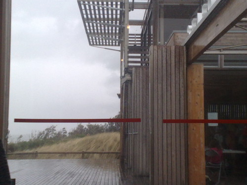
you can tell that the owners of the beach cafe have seen dollar signs and tried their best to replicate what they think would be a good look, without a sense of connection, passion or authenticity. hell, even the line protecting the birds from the glass (or vice versa), was a half-arsed line of orange tape, obscuring the amazing horizon. surely they could have found a better way that that?

and when you design with this in mind, you make a cold place and your job difficult. in fact, a place with a little attention to detail, good atmosphere and true spirit half the effort in running a social environment is taken care of. when people feel comfortable, or welcome, cosy – you know, it’s hospitable – the service, food and quality of coffee doesn’t get quite so much scrutiny and you can afford a bit of leeway.
however, with its awkward spaces and empty feeling, the sub-par food, the awkward staff, bad logos and uniforms at the beach cafe (and that title!) were obvious. in fact, we didn’t even want to stay for coffee and/or sweets, that’s how ‘perched’ we felt. given the beautiful building, it was disappointing.
and, in terms of bottom line, if you have 5 tables an hour NOT making an extra $12 on upscales, for 8 out of 9 hours’ trading, 5 out of 6 days a week, you’re losing a minimum of $2400. not to mention the lack of customer retention – the novelty of the beautiful building will wear off soon and you have to sustain them somehow. an empty box with a coffee machine doesn’t cut it – not in seaford, or anywhere else.