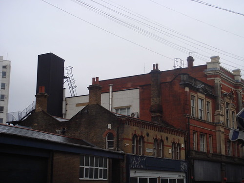
london is pretty grey at the moment. grey skies, lots of wet grey concrete, frosty windows, dark brown wet bricks and saturated black asphalt roads. you’d be forgiven for a frown every now and again.
and it’s in this monotonous colour field that london seems to have a history of wacky colourful architectural customisation.
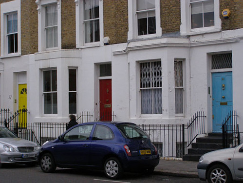
the first i noticed about it was the doors. islington, chelsea and kensington all have rows and rows of the same kinds of houses, separated only by their brightly coloured doors. apparently it was an early way to separate each house (unsubstantiated, but wikipedia gives me no love on the doors), and i guess a way to bring an individuality to the edifice, whilst still be ‘tasteful’.
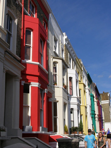
then, there’s notting hill’s love of painting each house in a row a different colour, seemingly as a way to give the street a bit of razzamatazz, in amongst the drab monotony of upper-middle-class life. or maybe just for the sake of a postcard shot – i don’t even know.
but seeing them again the other day, i started wondering why london loves its colour spectrum – from the doors and the garish houses, to the infamous tube map and its organisation/identification based on colour. is it as an antidote to the ever-pervading greyscale, or is it something greater than that? or am i reading too much into things..


