the last couple of days have been like a dream come true, really: art, coffee, art, coffee. as a result, my reporting is a bit behind.
on wednesday, with my inimitable art-pal, john dodds, i took in the V&A, the saatchi gallery and a weird place called chelsea futurespace (which i’m not going to go into, but it was kinda weird and all display-home).
V&A: 1:1 architecture spaces.
this was the exhibition highlight of the day, really.
a series of 1:1 spaces designed/built by architects as investigations into small spaces. there were 2 in a designated area for the show, with the rest dotted around the collection, perfectly responding to the various galleries and sections*.
all of them were great – you can see them here:
and here
but there was one in particular that totally floated my boat people and i’m going to devote the rest of my laptop battery to it: the bookshelf space.

the space, called Ark, by Rintala Eggertsson Architects is kind of a well-made, solid, ikea open bookshelf x 4, facing in on itself. the ‘walls’ are enclosed using books, the ground floor opens into the bookshop, whilst the roof meets the floor of the library upstairs. in between is a spiralling space of booky goodness! oh my lordy i almost fainted with overwhelm of all the books. i find going into book shops and libraries hard enough – i often need a chaperone in readings.
of course, john and i took the opportunity to do a quick little intervention into the space, rearranging the books to make a whole shelf of the conqueror by jan kjæstad – a massive paperback with a distinctive cover.
i loved the obvious idea of a place of literature, where knowledge is the foundation of space (something that john latham would have gone a bit goo goo about).
i also loved also the idea that this situation – a site and non-site of shifting space as the same time. and that small spaces were being created and filled in by books. and that no book was more or less important than another.
the whole colour palette of the place also had me gabbling – the exterior, with the exposed pine beams and then the out-facing pages were all the same colour, because they were all the same ‘stuff’. wood and paper together again.
and then on the inside, the colour explosion was so pleasing to the eye – in a way that something more contrived would just make me wanna vomit. part of me wanted to spend hours in there, organising all the spines by colour. but then the whole bottom floor would probably be orange 🙂

the smell of the place was so comforting and homely. it reminded me of all my favourite bookstores and the times i’ve spent with friends just wandering, head tilted, perusing.
if you’re in to books, in even the slightest way, go see this space at the V&A.
saatchi gallery: newspeak.
newspace too – i didn’t get a chance to pop in last time i was in the hood, so i’m grateful for the opportunity to do so. for the most part, the show was frightful. i haven’t had such a violent opposition to works in a while – there was some real shite there. but, there was also some excellent work, and some obvious themes being investigated, which was intriguing and enlightening. even if i didn’t like the particular works investigating those themes.
new british artists (still mostly painters, according to the saatchi kids – maybe because painting is still the prime-market) are mostly looking at human disfigurement and apparition.
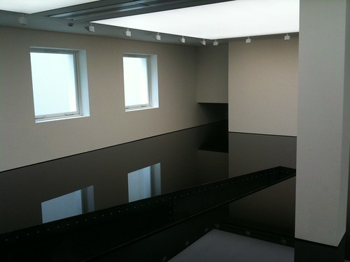
not part of this show, i loved two works in the two large project galleries: richard wilson’s 20:50 – a beautiful, reflective space made from the gallery filled with oil. the reflection was slightly disconcerting, the smell even more so. and as atmospheric and moody as the work was, i also ended up feeling angry that it somehow vindicates the disaster of oil-space c/- British Petroleum. I felt the need to make the work political by chucking a stack of animals in there to float and then see how beautiful it looked. not that it has anything to do with mr wilson’s formal concerns, i guess.
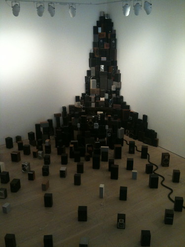
the other beautiful work was john wynne‘s pianola composition for 300 speakers – a stack of various speaker boxes, mostly beautiful old ones, with a pneumatic automated playing system that cardiff-miller and meireles would have been proud of.
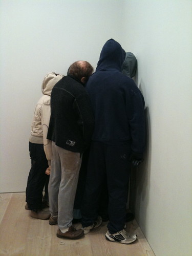
there were a few other good works, namely the pixel rug and guillotine by rupert norfolk and the boys in the corner by littlewhitehead.
it was great to see the gallery in the flesh – i hadn’t ever seen it. i expect it will be a fairly regular visit for me when i’m in london town now.
*almost funny anecdote about the studio mumbai work: you have to remove your shoes for this exhibit, and while we were putting them back on, we were accosted approached by education staff from the gallery to survey our response to the show. she kinda messed with the wrong sinatra, ‘cos when she asked about how i would describe the show to a friend, little did she know that my friends are all pretty well-versed in architecture/art vernacular and i started rattling on about interstitial spaces and textured experience. ha! what wanker i am.
ark images are from the V&A site and REA.